The Handmade Sign That Tries to Look Perfect
A handmade sign can be clear without looking machine-made. Learn how lettering, material and visible making shape a sign’s local character.
The most common mistake with a handmade sign is sanding away every wobble, then adding flourishes that make the words harder to read. The cost is a sign that looks self-conscious: its effort is visible, but its message gets lost. A handmade sign earns character another way, through clear lettering, a material that suits its setting and traces of the person who made it.
What does a handmade sign need to do first?
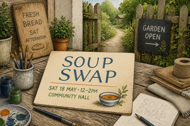
Start with the small job the sign has to perform. A paper notice in a bakery window might announce a bread-making afternoon; a board outside a community garden might point visitors toward an open gate. In either case, someone should be able to understand the main message without stopping to decode decorative letters.
That does not mean every sign needs to look like a road marker. It means giving the most important words the strongest visual position. Keep the main phrase distinct from supporting details, and leave enough open space around letters that they do not blur together from across a room or street.
Before choosing a style, ask where the sign will sit and how people will encounter it. A window notice is often read close up, while a sign on a fence may be seen as someone approaches. These situations call for different letter sizes, contrast and amounts of information. A carefully made sign responds to its actual surroundings rather than borrowing the look of a shopfront or event poster it has nothing to do with.
How can lettering stay readable without looking generic?
Lettering feels personal through its proportions and rhythm, not through needless difficulty. A steady hand-painted alphabet can still have human quirks: a rounded curve, a slightly uneven baseline or a particular shape for the letter R. Those touches add character while the words remain easy to recognize.
For a simple sign, write the wording in pencil on scrap paper first. Try the main phrase in plain block letters, then check whether the letter spacing remains open when the words are close together. If a brush-painted version is planned, use a brush that suits the size of the lettering; a very fine brush can tempt a maker to draw narrow letters that disappear at a distance.
Contrast matters, too. Dark lettering on pale card or light lettering on a dark board can separate the message from its background. Decorative borders and extra colors may suit the occasion, but they should not compete with the words. A reader’s eye should find the message before it notices the ornaments.
Which material belongs in this place?
Material changes how a sign feels before anyone reads it. Brown kraft paper may fit a casual stall, while a reused wooden board can feel at home beside a garden gate. A piece of linen or painted cardboard can suggest a more crafted, temporary welcome. None is automatically more authentic; the useful question is whether the surface belongs with the place and can handle its conditions.
Think about the sign’s expected exposure. A paper notice inside a dry window does not need the same treatment as a board that may meet wind or rain. For a temporary outdoor display, a sheltered position or a suitable backing may matter more than adding elaborate decoration. Check product labels and manufacturer instructions for any coatings, adhesives or materials whose use depends on conditions.
Surface texture affects lettering. Rough wood can make a fine brush skip; slick card may resist some paints; fabric can soften the edges of a painted line. If the surface has pronounced grain or folds, keep the wording simple enough to remain legible across those interruptions. The material should contribute to the sign, not make the message fight for attention.
What do the marks of making actually add?
Evidence of making is not the same as visible mess. A brushstroke that follows a letter’s curve can show how it was formed. A small change in line weight may reveal where the maker turned the brush. By contrast, a paint smear across a word is not automatically charming; it may simply obscure the information someone came to read.
There is a useful distinction between an intentional irregularity and an unresolved problem. A hand-cut edge can make a paper sign feel direct. A letter that is too cramped to identify creates friction instead. Keep the marks that give the work a human pace, and correct the ones that interfere with its purpose.
Say you are making a notice for a neighborhood soup swap on a sheet of cream card. You draft the event name in broad blue letters, add a smaller line with the day and location, then paint a simple bowl in one corner. If one letter sits a little higher than its neighbors but remains easy to read, that unevenness can stay; if the bowl crowds the location, moving it matters more than perfecting its outline. The expected result is a notice that feels made by hand while still giving a passerby the information they need.
How do you balance finish and character?
Use a small editing pass rather than polishing everything. Look first for missing or ambiguous information, then for lettering that is difficult to read, then for visual clutter. Only after those issues are settled should you decide whether an edge, color or flourish needs attention.
- Read the wording aloud. If the message sounds incomplete, add the missing detail before decorating.
- Step back to the likely viewing distance. If the main words disappear, enlarge or simplify them.
- Check the contrast. If letters blend into the surface, change the color pairing or reduce background decoration.
- Look at the material’s texture. If grain, folds or glare break up a word, adjust the placement or lettering style.
- Separate character from obstruction. Keep a harmless handmade quirk; revise a mark that hides useful information.
What is not worth the effort? Correcting every tiny variation in a letter’s curve. That work can consume time without making the sign easier to understand, and it may erase the relaxed quality that drew you to making it by hand.
What should you decide before making the sign?
How much text should a handmade sign include?
Include the information a passerby needs to act, and leave background explanation for another format. A short main message with a clear supporting detail is often easier to scan than a paragraph squeezed onto a board.
Should handmade lettering be perfectly even?
It should be consistent enough to read, not mechanically identical. A little variation can suit a hand-painted sign as long as letters remain distinct and their spacing does not collapse.
Does a handmade sign need decoration?
No. A border, small drawing or extra color can support the subject, but plain lettering on an appropriate surface can carry just as much character. Add decoration only when it helps the sign feel connected to its purpose or place.
How can you tell when to stop refining it?
Stop when the message is clear at its intended viewing distance, the material suits the setting and remaining irregularities do not distract. A final round of polishing is not automatically an improvement.
Why does a slightly imperfect sign feel local?
A handmade sign belongs to a place when its choices make sense there: the words suit the gathering, the surface suits the surroundings and the visible marks suggest a person rather than a print template. Its character does not depend on looking rough, any more than it depends on looking flawless. The best handmade sign lets the message arrive first, then gives the curious reader something small to notice about how it was made.
That is a useful standard for the next sign you make: preserve the evidence of a hand, but do not ask a reader to work around it. When legibility, material and making each have their own job, the result can feel cared for without pretending to be perfect.